


Our Approach
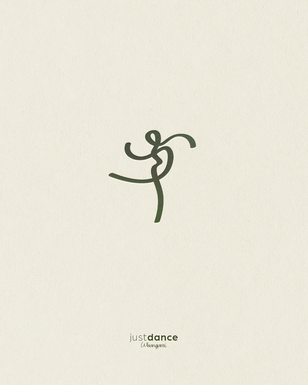
We set out to create a fresh visual identity for Just Dance, celebrating the energy, creativity, and community at the heart of the studio. With a long-standing history in Whangārei and a love for nurturing dancers from their very first classes through to advanced training, the branding needed to feel welcoming, expressive, and full of life. The direction was to create something that captured the joy of movement while giving the studio a more distinctive and cohesive identity.
The Solution
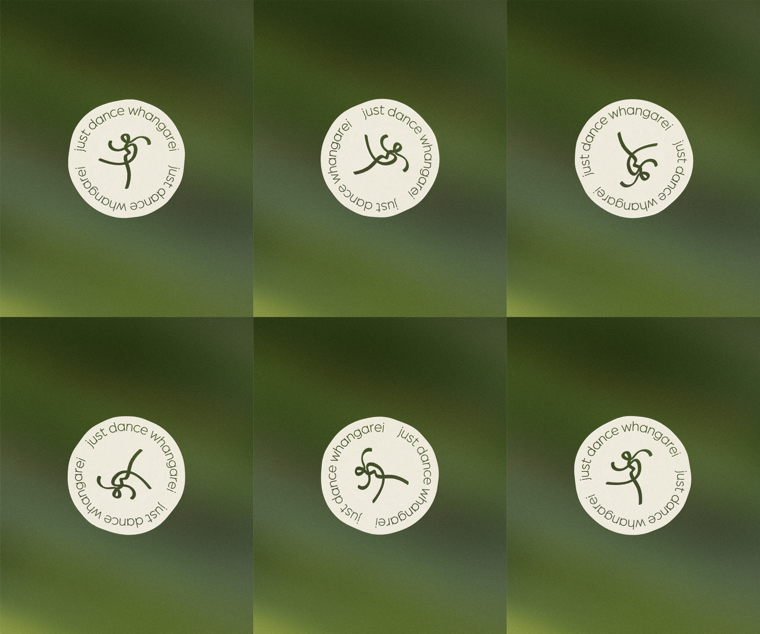
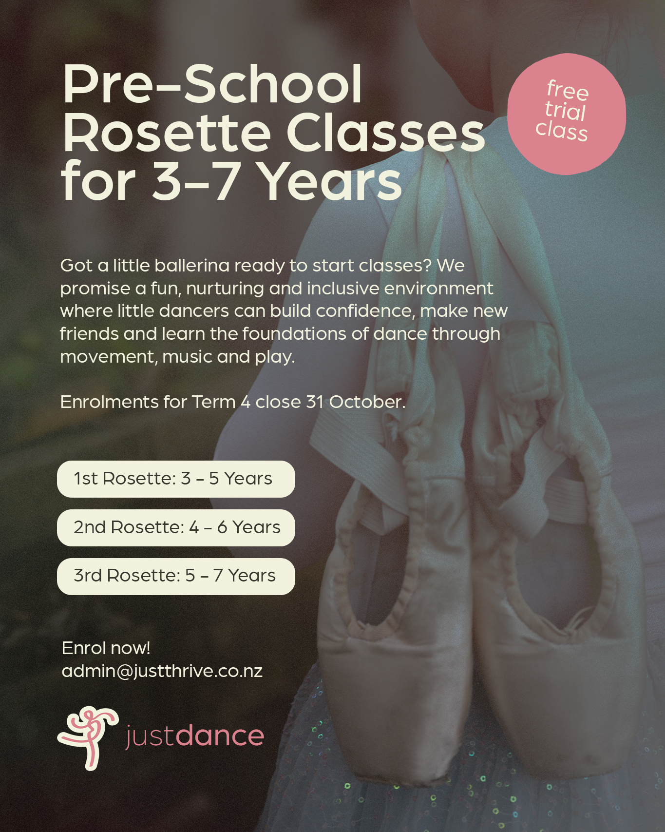
A playful yet considered visual identity brings a fresh sense of personality to the Just Dance brand. Through expressive typography, a vibrant colour palette, and a collection of supporting graphic elements, the identity celebrates the movement, rhythm, and individuality of dance. The visual language balances youthful energy with a sense of refinement, allowing the brand to appeal to dancers of all ages while remaining recognisable across its digital and physical touchpoints. The refreshed branding creates a consistent look and feel across the website, promotional materials, and studio communications.
The Outcome
A confident, contemporary identity that reflects the spirit of Just Dance and the community it has built over the years. More than simply a dance studio, the brand celebrates the friendships, confidence, creativity, and lifelong love of movement that grow within its walls. A fresh visual foundation gives Just Dance room to continue evolving while staying true to the people and passion that have always made it special.
