
Our Approach
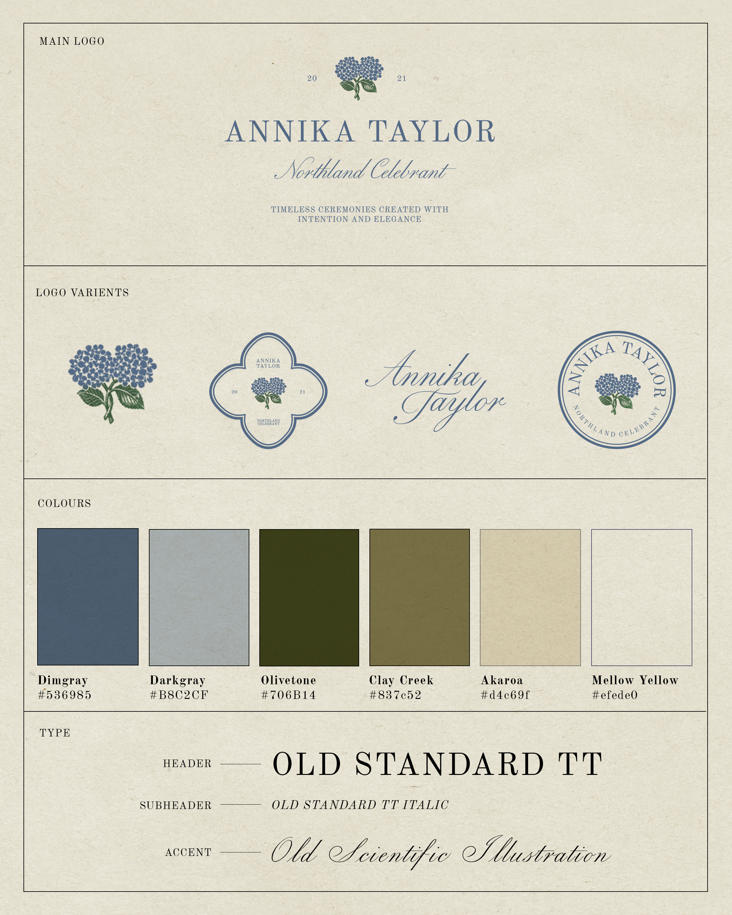
We set out to create a visual identity that captures the romance, beauty, and thoughtful nature of Annika Taylor’s celebrant services. Inspired by the timelessness of traditional ceremonies and the natural beauty of Northland, we developed a brand that feels elegant, personal, and full of meaning. The identity reflects Annika’s approach to creating ceremonies that honour each couple’s story, bringing warmth and intention to life’s most special moments.
The Solution
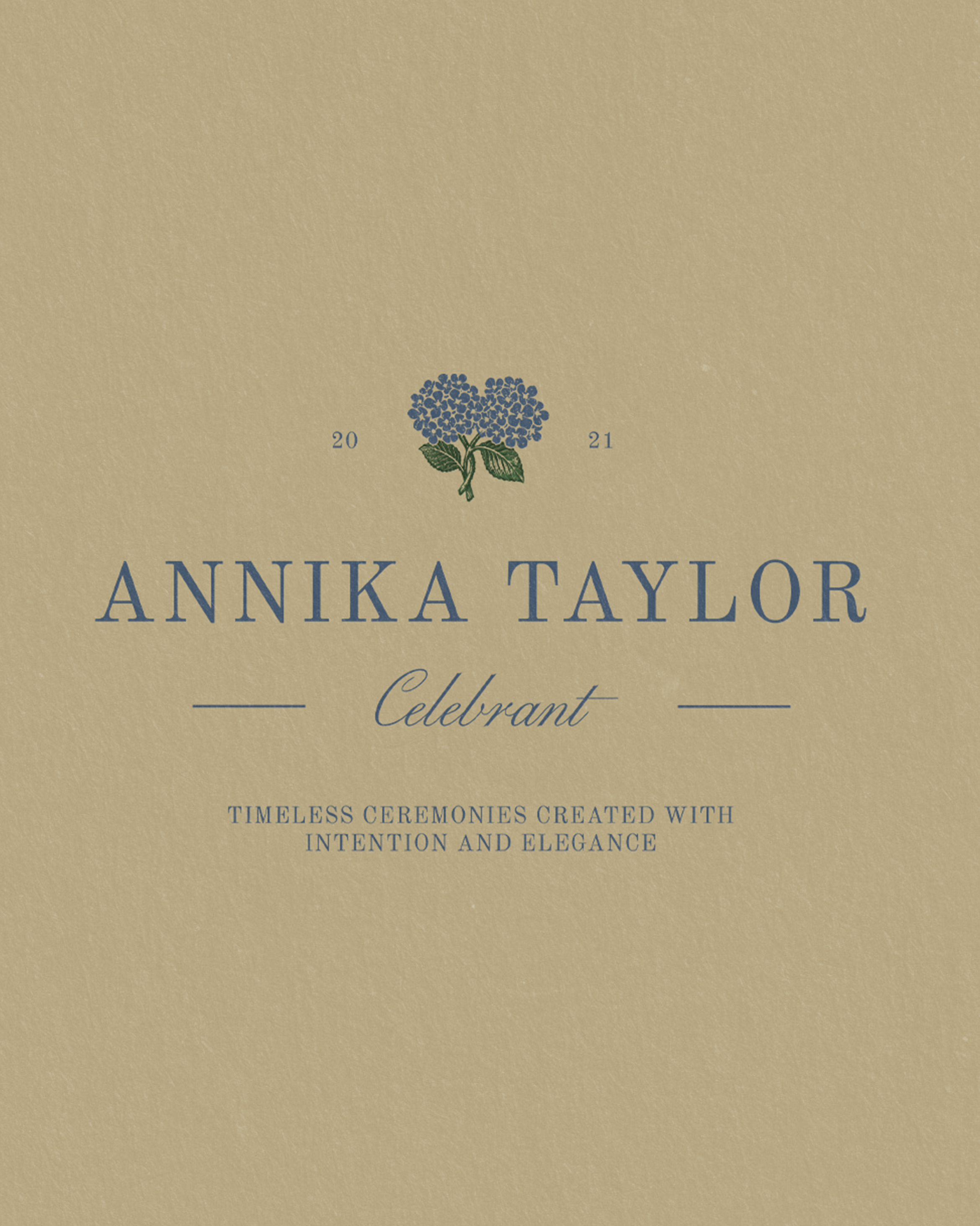
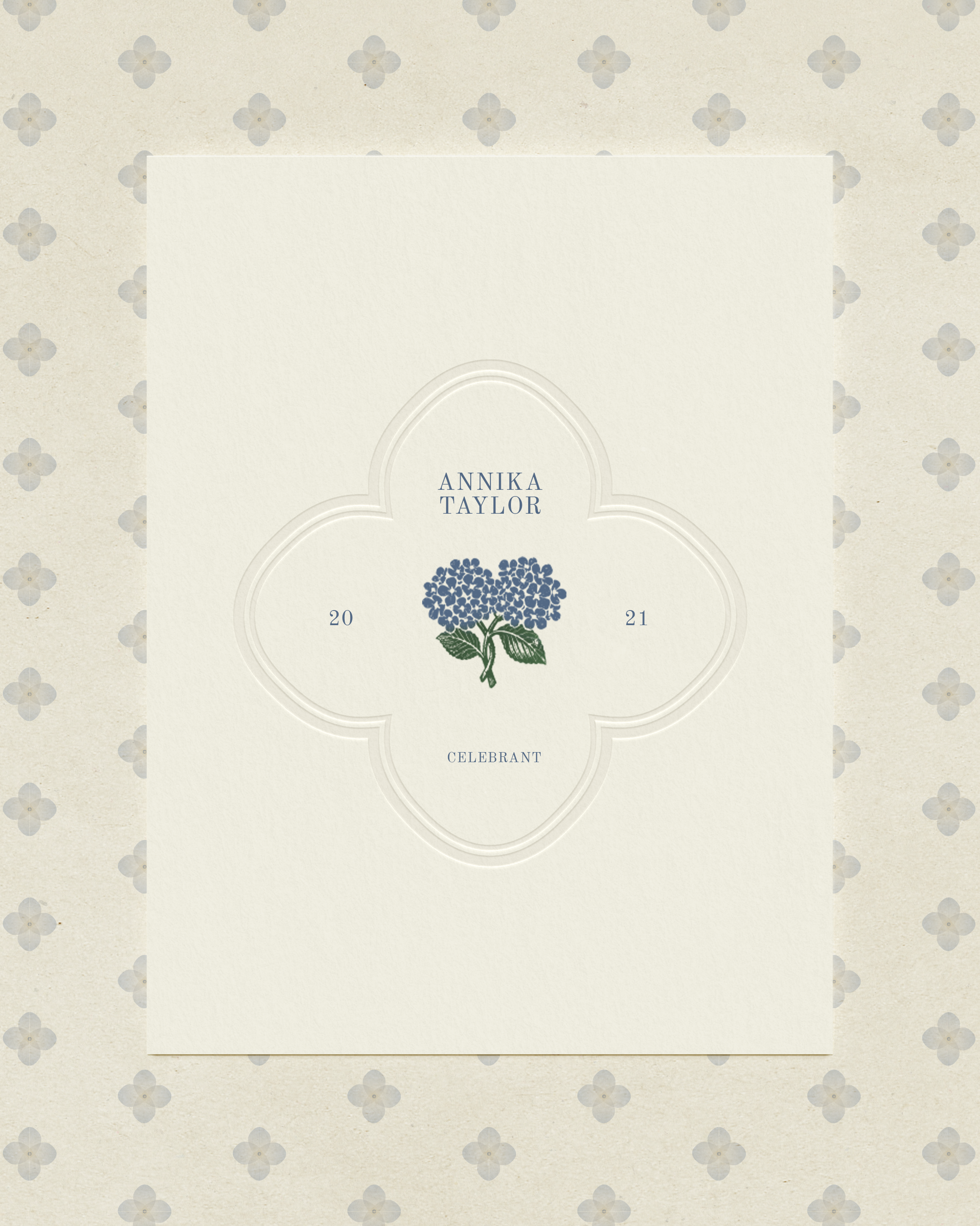
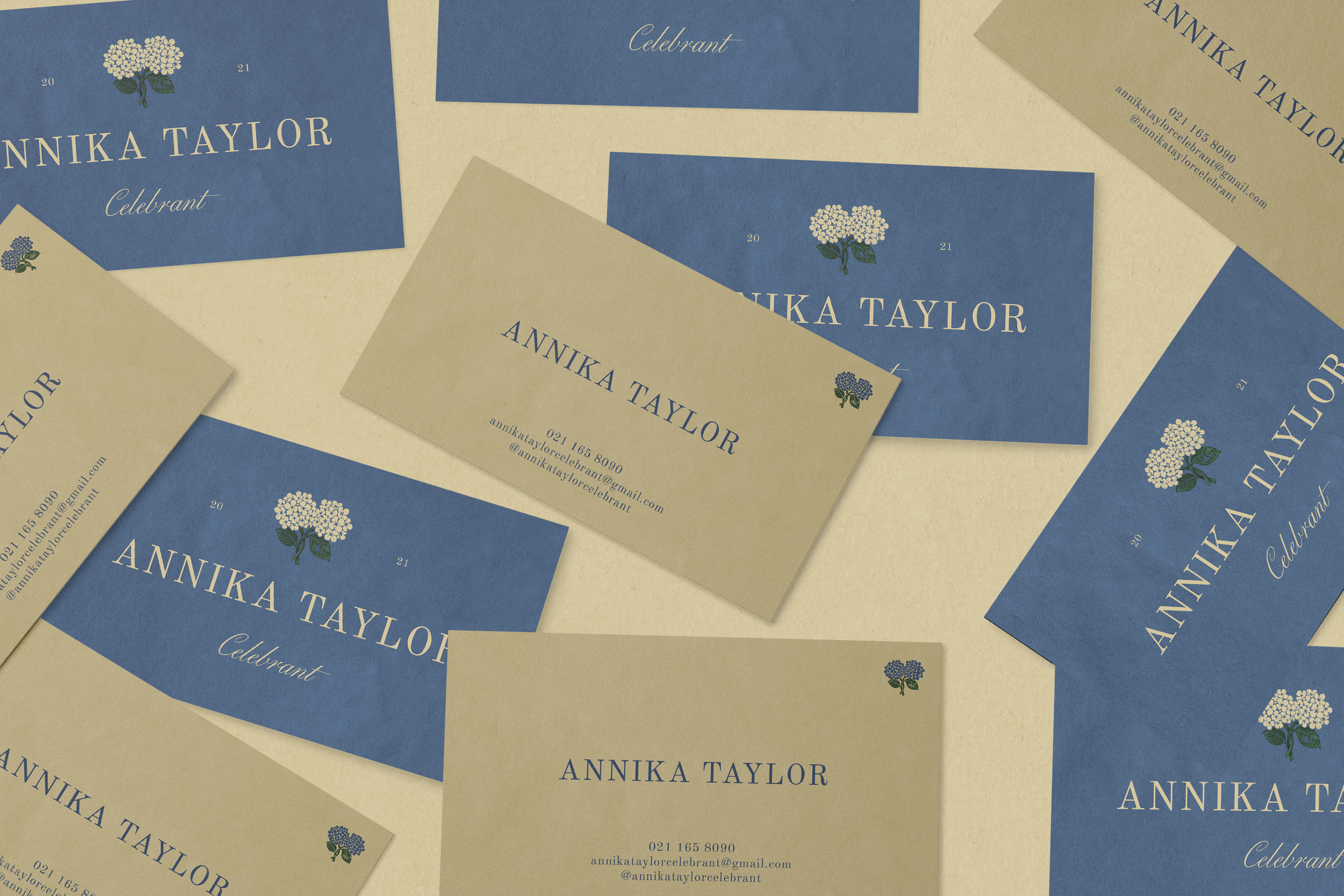
At the heart of the identity is a delicate hydrangea illustration, inspired by the flowers growing in Annika’s own back garden. This personal detail brings a sense of familiarity and sentiment to the brand, making it uniquely hers. Paired with refined serif typography and flowing handwritten script, the visual language balances classic elegance with a soft, personal touch. A muted palette of dusty blues, olive greens, and warm, natural neutrals creates a feeling of calm and understated sophistication.
The Outcome
A graceful and recognisable brand that feels deeply personal to Annika and the ceremonies she creates. By drawing inspiration from her own surroundings, the identity brings a little piece of her world into her business, while establishing a timeless visual presence that feels just as special and meaningful as the stories being celebrated.
